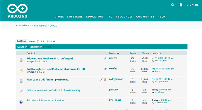
I think you must be misremembering. It is true the website design was as you remember before 2021, as you can see from the screenshots on this post from 2020-09-02:
But the design of the website was changed years ago into something like a collection of sub-sites. The header offers direct navigation to the main site as well as selected sub-sites (e.g, Professional, Education, Store).
But to get from one sub-site to any of the other sub-sites (e.g., Forum, Docs), you must first navigate to the primary site.
It has been that way for the last couple of years. For example, see the screenshot on this post from 2022-12-20:

The design isn't about the margins. It is about the width of the text. The wide margins are only a side effect of limiting the text width. The devices you mention have a small horizontal display dimension so the width of the text is inherently limited even though the full display width is utilized.