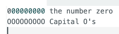
I’m not sure, but this seems to be a recent change. I’m seeing zeros with dots in the middle, in Code sections and in the basic editor. I assume this is to distinguish a zero from a capital "O". But it also makes the zero look like an "8", so on balance it's more confusing to me. Anyway, is there anything I can do on my end to change the font to something else that doesn't use dotted zeros? If not, would management consider making this change?
What you are seeing is one of the recent “improvements” implemented in the Discourse reply editor. The font changed when the option to use the WYSIWIG editor was added.
Try clicking the leftmost icon above the reply editor to see what I mean. You may prefer to user the WYSIWYG editor
Unfortunately the font does not change in code sections whether you are using the WYSIWYG editor or not
@pert may be able to provide more insight into the changes
Some browsers allow you to override their default fonts with a setting or a style sheet.
You can read more about the change here:
Ok, so the dots disappear using the rich text editor, but they are still present in code. Well I’m using Firefox in Windows 10. Is there a way to override the font selection?
Anyway, I hope changing back to the previously-used font will be considered. Unless of course everybody else likes the new one.
2 Likes
Well, aside from the shape of the "zero" character, I don't like the "standard editor" font at all. Not for aesthetic reasons, but because that "new" font ("Jetbrains Mono"?) is completely different from the standard font used for displaying posts ("Open Sans"?). I wonder why one shouldn't just keep using the standard font in that editor.
PS: I know I can switch to the WYSIWYG editor, but as a pretty old user I like to keep going with what I used for years.. ![]()
Me neither
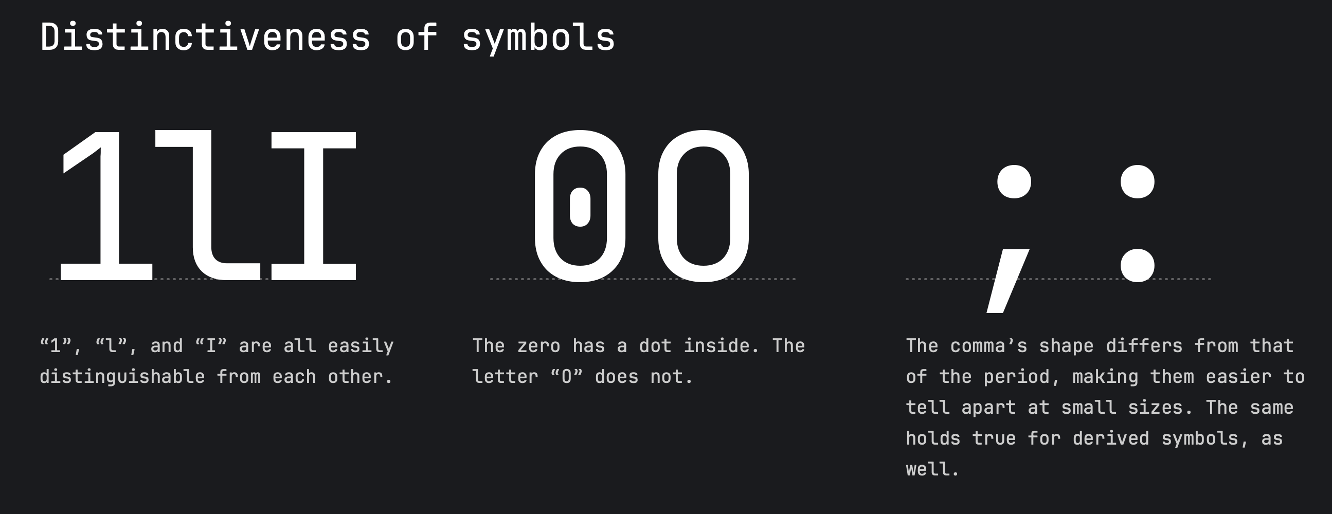
I appreciate the use of a mono spaced font in a program listing for alignment and am partial to Monaco just because it’s been used on the Macintosh since the beginning. It also has the slashed zero that I find easier to separate from the capital oh.
When the forum default editor switched to a mono spaced font I noticed it immediately and found it a little strange to the eye because I’m accustomed to the proportional style font in normal text. I don’t like the zero with the dot and it would be nice if a proportional font with a slashed zero could be used for the default text and a mono font with the same style zero for program listings.
2 Likes
Doesn’t the webpage specify to Firefox, for example, which font to use for a particular block of text? As opposed to doing some kind of bitmap thing? If so, would it be possible to add a CSS that changes occurrences of “JetBrain Mono” to “Lucida Console" or “Monaco” in the html for this forum? I assume Firefox can access all these fonts.
1 Like
Safari has that capability. I haven’t tried it yet.
First, settle on a monospaced font. I have neither Lucida Console nor Monaco on this Linux box, but there's Noto Mono. The OS should provide some kind of font viewer. (You might also try some wacky obvious font just to see if the substitution is working.)
I followed these steps to override the CSS in Firefox
- Re-enable the feature that allows this
- Go to
about:config - Click "Accept the Risk" for changing advanced configuration options
- Search for "
legacyUser" to find the settingtoolkit.legacyUserProfileCustomizations.stylesheets. It'sfalse - Toggle it to
truewith the button on the right end of the row
- Go to
- Find your Profile Directory
- Open the Help menu
- About Firefox shows version
138.0.1(I have an update to v140 pending)
- About Firefox shows version
- Open "More troubleshooting information"
- In the first section, "Application Basics", is "Profile Directory", the 12th item down
- Note the directory just in case:
${HOME}/.mozilla/firefox/{random?}.default-release - Click "Open Directory". Now there's an open window for it.
- There's probably no directory there named "
chrome". Create it. (Its siblings would include "browser-extension-data" and "crashes") - Open "
chrome"
- Open the Help menu
- Add CSS to the file "
userContent.css" there- You may be able to create the file directly in the window. Or create the file elsewhere and then move/copy it to "
chrome" - The editor element is (at the moment)
<textarea aria-label="Type here. Use Markdown, BBCode, or HTML to format. Drag or paste images." autocomplete="off" placeholder="Type here. Use Markdown, BBCode, or HTML to format. Drag or paste images." id="ember557" class="ember-text-area ember-view d-editor-input"></textarea> - Inspecting the element shows that the effective CSS is from "
d-editor.scss", yielding thefont-family:JetBrains Mono, Consolas, Monaco, monospace
- You may be able to create the file directly in the window. Or create the file elsewhere and then move/copy it to "
This is the CSS to put in the file.
@-moz-document domain(forum.arduino.cc) {
    textarea.d-editor-input { font-family: Noto Mono, monospace !important; }
}
Save the file. Restart Firefox (make sure all the windows, like the About box, are closed first)
From what I see as I type this, it worked. I do notice in the preview that monospaced text, like that 138.0.1 version number, still uses the previous font. So find the CSS selector for that, and add a rule to the CSS. Holler if you need a hint.
0000
Yes,it looks like that works just fine when typing in text.
But code sections still use the old font, as you said. So I'll have to figure that out.
0000
Thanks very much.
I'm going to need that hint, and maybe more than a hint. I don't know how to find what textarea, or whatever, needs to be changed.
OK, right-click and Inspect the text
- The inline text like
1.138.0is<code>1.138.0</code> - The section of that CSS above is
(This indicates the language<pre data-code-wrap="css" class="codeblock-buttons"> <code class="lang-css hljs language-css" data-highlighted="yes">cssthree times. There's also a section ofhtmlin my previous message, and the two above here. With no specific language chosen, just the three backticks, the language isarduino)
So just plain <code> would work. For CSS, multiple selectors are comma-separated. Change that userContent.css to
@-moz-document domain(forum.arduino.cc) {
    code, textarea.d-editor-input { font-family: Noto Mono, monospace !important; }
}
and restart.
In my opinion, they should use the same font in both (standard) editor and threads shown. No point in having different appearance, and no reason in changing to this Jetbrains font on the standard editor and Open Sans on the WYSIWYG.
As captured in that snippet of the Meta discussion above, the point of different typefaces is
This helps clarify to users that you are in “markdown” mode vs “rich” mode.
Whether that is persuasive or a net positive is debatable.
It is all very well having different fonts in different editor modes but the Markdown editor mode font is awful.
To add insult to injury the same awful font is used in code blocks where the confusion between 0 and 8 is even more important
//is this an eight or a zero 0
//and what about this 8