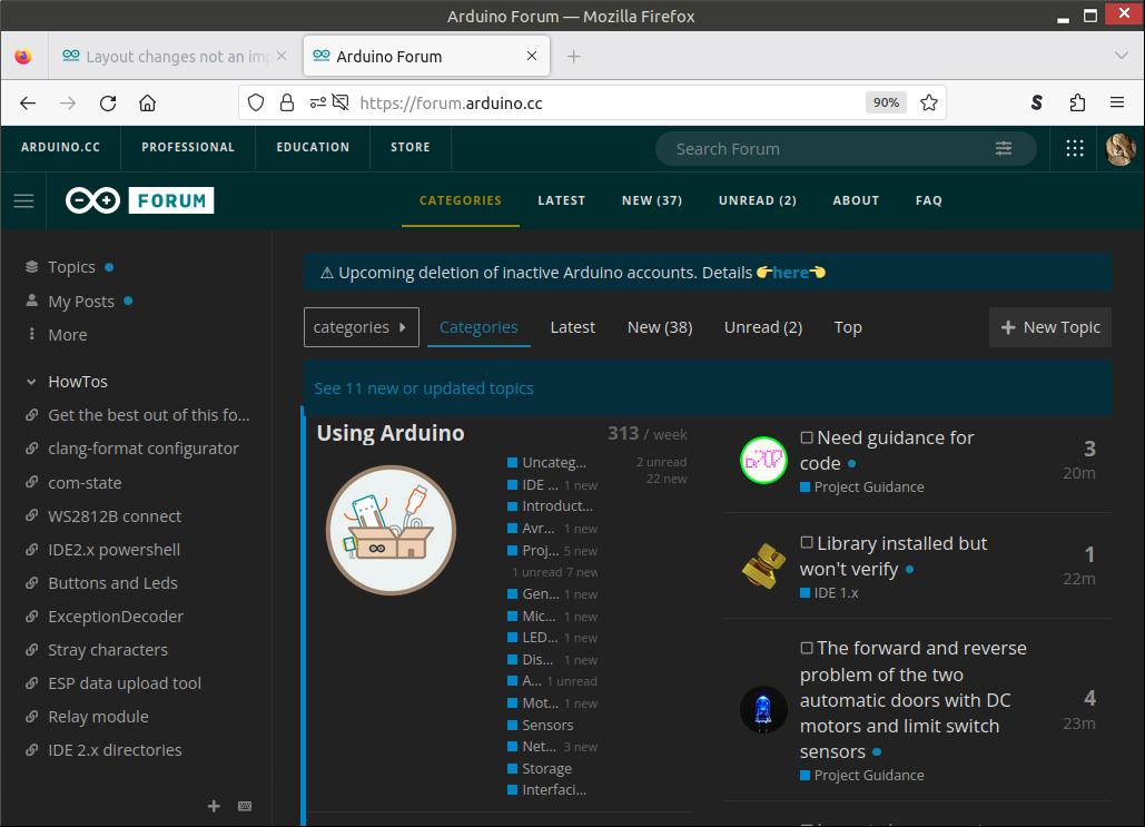
See topic title

I now need to maximize the browser (1280 wide) to be able to read the subcategories.
FireFox 115.10.0esr (32-bit)
Antix Linux
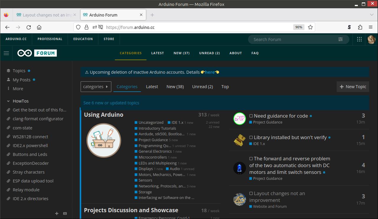
See topic title
I now need to maximize the browser (1280 wide) to be able to read the subcategories.
FireFox 115.10.0esr (32-bit)
Antix Linux
There is to much space used to make things look nice but not enough to make them readable. There are many websites guilty of this. This is better then many.
Looking at it again, there are categories missing in the screenshot. There should be two categories starting with a 'P', Project Guidance and Programming Questions.
It looks like they are merged
2 new
4 unread 7 n (new)
Whoever made those changes, please revert.
I'm unfortunately starting to get pissed off with these changes that ain't announced.
Minimum required width for this to be usable seems to be 1280 which is the maximum of my laptop. I already have zoom set to 90%, 80% is too much (maybe I need new glasses ![]() )
)
Browser window width 1029 (note that Programming Questions is not readable).
Browser Window width 1280
Just for the fun, 100%
Browser window 1029 (absolutely useless)
Browser window 1280
I thought that I tried that and did not observe that it made a difference. But it indeed helps.
Not too eager to use that option but I guess I have to adjust for now.
It actually does make a difference. The side (at the left) depends on the size of the browser window and I now don't have a left side.
You're late to the party ![]() See Layout changes not an improvement
See Layout changes not an improvement
But there isn't feedback yet as to the why.
I've merged your topic with the existing one.
It is now so "deurmekaar" I did not even saw the Post about the changes.
Not to me. Not from a usability perspective.
Look at all the wasted space.
It was bad before this update, now it is even worse.
There is no need to waste so much space on the goofy round icons.
At a minimum if the icons are desired put them above the categories/topics so they can be left adjusted to show more of the titles.
Then look at all the wasted space to the right.
Lots of screen real estate is just wasted.
Given a choice, why would anyone WANT a page to be formatted and layed out like this?
IMO, it greatly reduces usability and just looks amateurish.
--- bill
One of things I've never understood is why is there a "Latest" column when you have the "Categories" tab selected?
None of the other tabs work this way.
IMO, a big part of the problem is trying to jam "Categories" and "Latest" in two columns on the "Categories" tab.
IMO, an improvement would be to have a "home" tab that allows a user to select & configure what information/tabs are shown when the "home" tab selected.
Maybe have an option for a single vs 2 columns on the "home" tab.
(If the developers are lazy they could just make the current "Categories" tab the "home" tab with no configuration)
But then make the "Categories" tab be just the categories and use the full horizontal space just like the "Latest", "New", "Unread", and "Top" tabs do.
--- bill
On an iPad in portrait, the forum was almost perfect, now, it’s almost unusable.
My suggestion revert ASAP, please, or make it a user choice.
Still trying to use latest forum…
It’s really an abomination,
I’m going on leave until it gets fixed.
Please message me when it gets fixed.
This topic was automatically closed 180 days after the last reply. New replies are no longer allowed.